We all know first impressions are everything. This holds especially true for businesses. What better way to impress potential customers or clients than a well-maintained exterior and interior? Choosing the right color(s) for your business can be vital.
The potential of a well-planned space from paint to walls to the little details can actually make quite an impact. To help save you some time and effort, we’ve created a color guide for commercial building painting.
Colors & Emotions
Colors can influence emotions. Different colors affect different people in various ways, yet studies have shown that there are some general rules that are widely applicable.
- Red ignites feelings of energy, leadership and passion.
- Orange is friendly, cheerful and enthusiastic.
- Yellow is clarity, optimism and happiness.
- Green represents nature, health and wealth.
- Blue is peaceful, reliable and professional.
- Purples are creative, wise and royalty.
- Pinks evoke feelings of love, friendliness and compassion.
- White is clean, to the point, and brings balance.
- Neutral tones bring a sense of ease and calmness.
Consider staying true to your brand
In an environment where the things you sell are sold in other places, your shopping experience (aka your brand) is what makes you different. A great way to make your brand recognizable is to use similar or the same colors as your logo or brand. If your company already has a specific color palette across your logo, business cards, website, etc., consider using or slightly altering these paint colors. Can you recall walking through Home Depot, Lowes or Best Buy?
Conversely, if your space is a gathering space (e.g., office, library, or church), consider the psychology of color to invoke a feeling. A consistent color palette will reinforce your brand identity.
Brand values should be aligned to convey a message, the same goes for your paint color choices. They should consistently reinforce this message. The right color scheme will help your business stand out, but it can also contribute to building brand recognition and loyalty.
Consider color theory and pair accordingly
Based on how colors work with one another on the color wheel and color theory, companies often use one of four schemes: monochromatic, complementary, triadic or tertiary.
- Monochromatic colors are different hues, shades, or tints of the same color.
- Complementary colors are pairing colors from opposite ends of the color wheel. (i.e. red and green; yellow and purple; orange and blue; green and magenta. Complementary color combos tend to be bold, which is why sports teams often use this formula for their colors.
- Triadic colors are a unique variant of the split complementary color scheme, with an equal distance between all colors. All three colors are distributed evenly around the color wheel, causing there to be no clear superiority of one color.
- Tertiary colors are a blend of either two secondary colors or a blend of a primary and secondary color to create a new shade. (i.e. Chartreuse (green + yellow), Spring green (green + cyan), Azure (blue + cyan), Violet (blue + magenta), Rose (red + magenta), Orange (red + yellow).
While each of these can help create quite an impression, a complementary color scheme seems to be the best choice for commercial painting projects. When it comes to complementary colors, the first color should be the main color, while its opposite should be used for accents and highlights.
Take a look at the surrounding buildings
Brand colors aren’t the only thing to take into consideration. Exterior color choices are restricted in some commercial districts, particularly historic ones. Keep this in mind and adhere to the district’s architectural and landscaping guidelines.
If no clear guidelines exist, the decision boils down to whether you want the structure to stand out or blend in with its surroundings. Consider the buildings surrounding your business, such as neighborhoods, office complexes, industrial districts, and parks.
Choose an experienced commercial painter
When it’s time to paint your commercial property, invite Modern Painting to visit for your free estimate. Our team of painting professionals has tackled projects large and small, and we’re ready to help you transform your property with a high-quality paint job.
Need some inspiration?
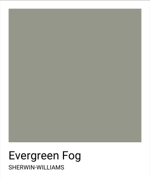
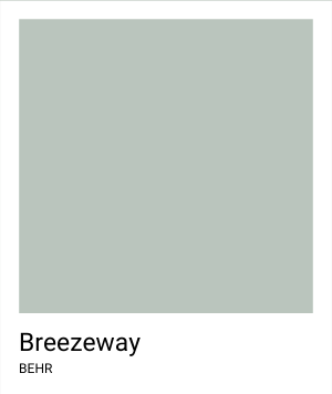
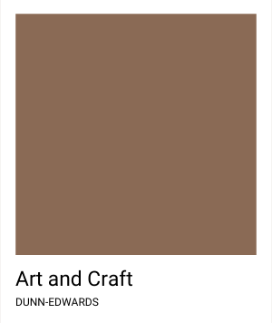
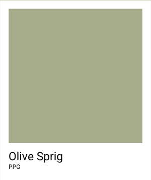
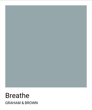
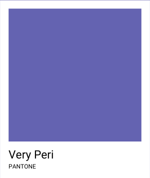
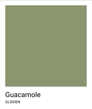
After reviewing this year’s color of the year for multiple companies, it seems that it’s neutral colors for the win! Here are the 2022 Colors of the Year from major paint manufacturers:


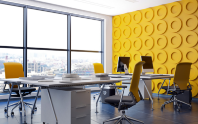
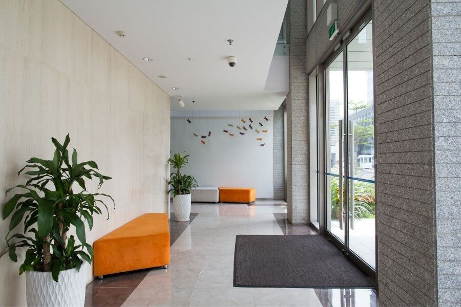
Choosing the right commercial office colors can make a huge impact.
Suppose you’re thinking about repainting your commercial office space. In that case, you’ve...
What to Expect When Getting a Commercial Painting Estimate
For building owners and managers, the task of having your building painted can seem overwhelming....
Is there a best time of year for painting your facility?
Variations in Ohio weather can greatly impact the quality of a paint job, particularly exterior...