Suppose you’re thinking about repainting your commercial office space. In that case, you’ve probably heard about how big an impact the right color choice can have on the overall mood and productivity of the office. The psychology of colors in the workplace can be a bit complicated and it may seem like an overwhelming decision to make, but it doesn’t have to be.
According to ColorMatters, harmony in visual experiences refers to the pleasing aspect that captures the viewer’s attention and creates an inherent feeling of organization and balance. When something lacks harmony, it tends to be either dull or chaotic. On one end of the spectrum, a visually uninteresting experience fails to engage the viewer as the brain naturally dismisses stimuli that lack stimulation. On the other end, an excessively chaotic visual experience becomes overwhelming to the point where the viewer cannot bear to look at it. The human brain rejects what it cannot comprehend or organize. Therefore, achieving a logical structure is essential in visual tasks. Color harmony plays a significant role in generating visual intrigue and establishing a sense of order.
Color Wavelengths
All colors are divided by wavelengths. Colors with a lower wavelength, like a calming blue or green, will help improve your focus and efficiency. These are the two most common colors found in nature, so they tend to invoke feelings of overall well-being. Basically, if you want employees who feel satisfied with their jobs and feel happy, consider choosing blue or green as the primary color for your office.
On the other hand, red, which is a high-wavelength color, can come off as a bit intense at times. It’s one of the colors that really inspires passion, and can increase a person’s blood flow as well. Therefore, if there’s anything in the office that you want to draw your employees’ attention to immediately, just paint it red! I wouldn’t recommend surrounding yourself with this color, as it’s been shown to increase agitation and aggression when employees are encased in such a bold color. Think accent wall only.
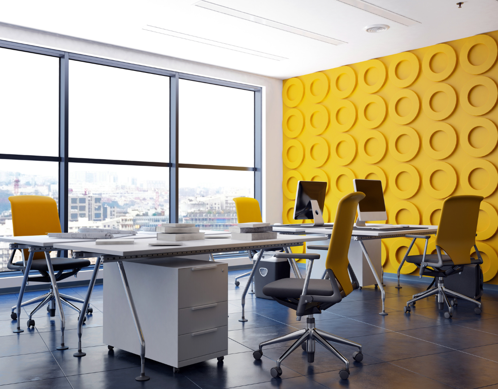
Ahhh yellow. You think yellow and if you’re like most people, you think of the color of a sunny day. The mellow shade of yellow, which many psychologists view as the color of optimism, invokes feelings of freshness and renewed energy. It’s most commonly used in offices that deal with designers, creative professionals, and developers.
Lastly, black is back. Black may seem harsh, but when used sparingly and strategically, black can make any workplace look sleek, professional and dominant. The color is considered a must-have because it pairs nicely with a variety of products, patterns, and textiles. I would save this color for office spaces with a ton of natural light. Save black for accent walls or to paint industrial fixtures, columns, etc.
Which Color Should You Choose?
Ideally, a variety of different colors should be used in an office space to create balance. Avoid painting the walls all white, and make sure that you don’t overuse any particular color. A vivid, brightly colored workspace will help increase motivation. Colors also help lighten the mood, so if there is any sort of frustration or conflict between employees, certain colors may help allay such tensions. These are just a few important things that you should know when it comes to selecting the right colors for your office space. For more help with color choices, contact Modern Painting and Coating.